


Strategy
I wanted to bring what Albanese represents into the picture. Vibrancy, Albanese’s history & values, creativity, and consistency within the visual identity, and branding.
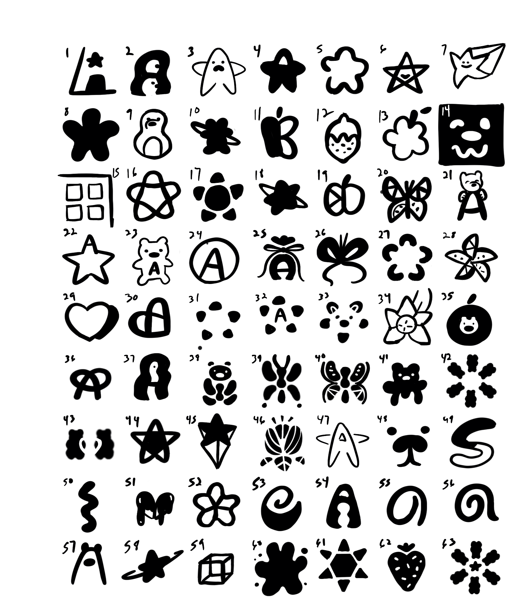
For the logo, I experimented with key values that Albanese holds, and played with symbolism representing such.
Overview
Albanese Candy is an American-made confectionery manufacturer, retailer, and distributor located in Merrillville, Indiana. They specialize in making nuts, chocolates, and their most popular–gummi candies.
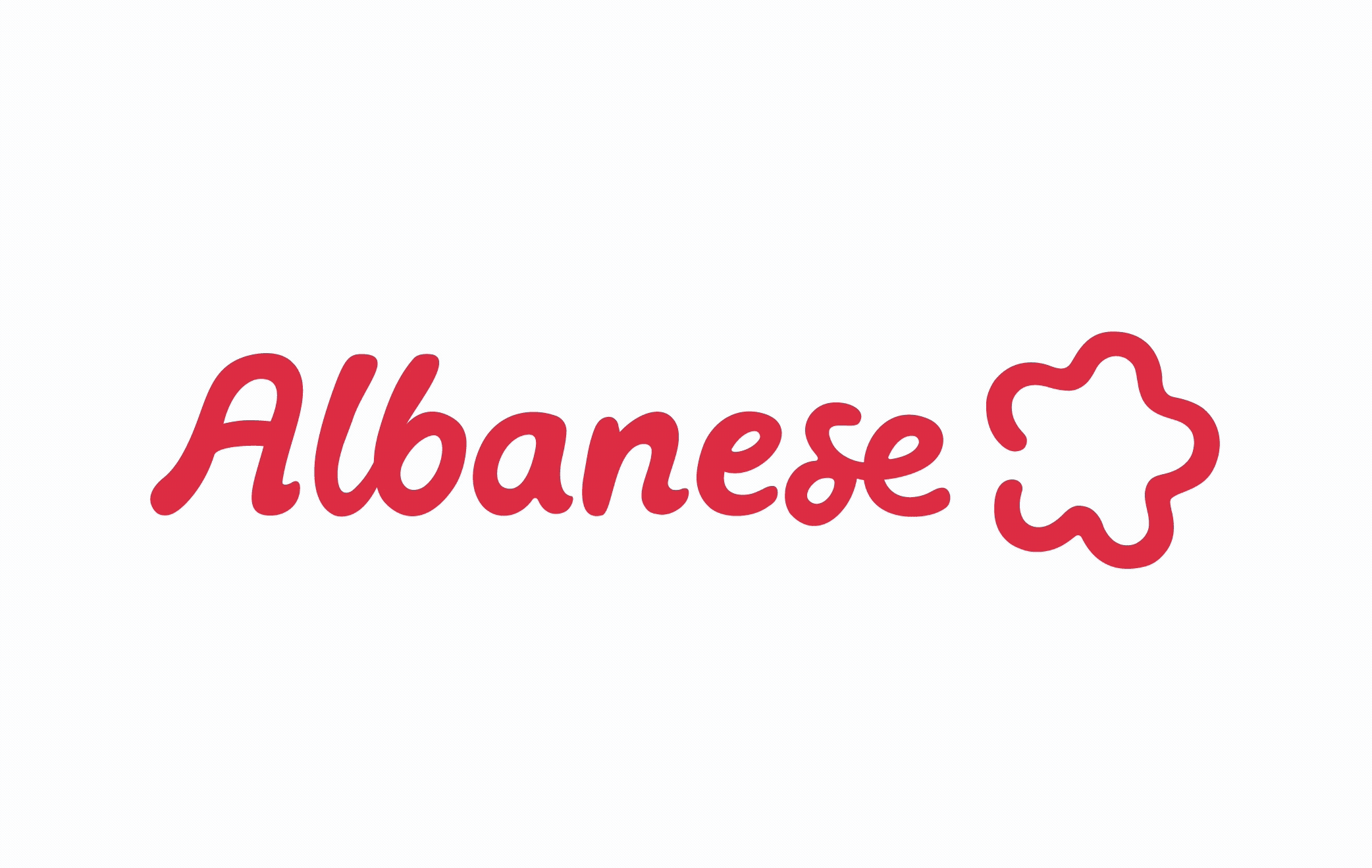
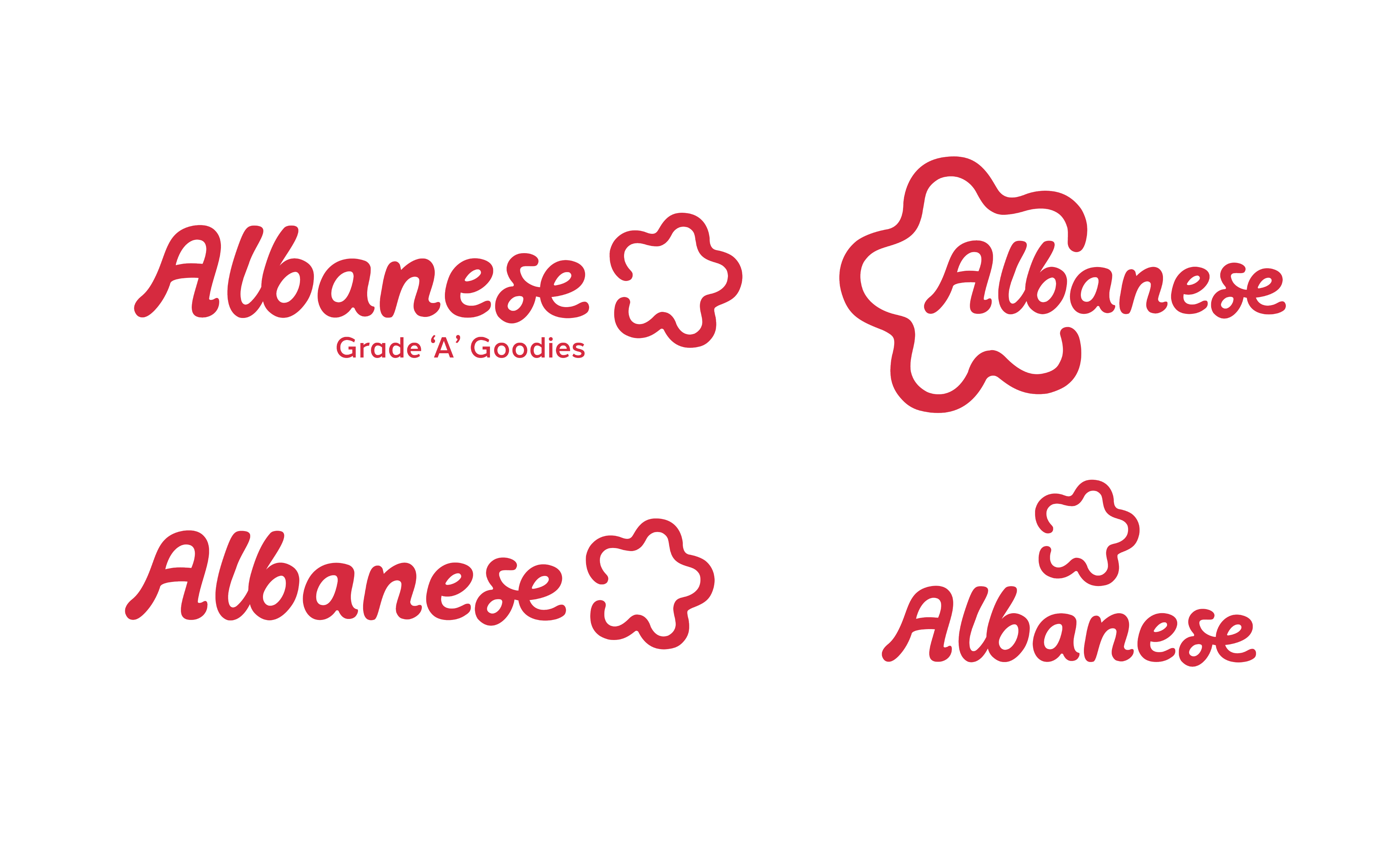
Logotype
Hand-drawn logotype done in Procreate on an ipad and then refined in illustrator
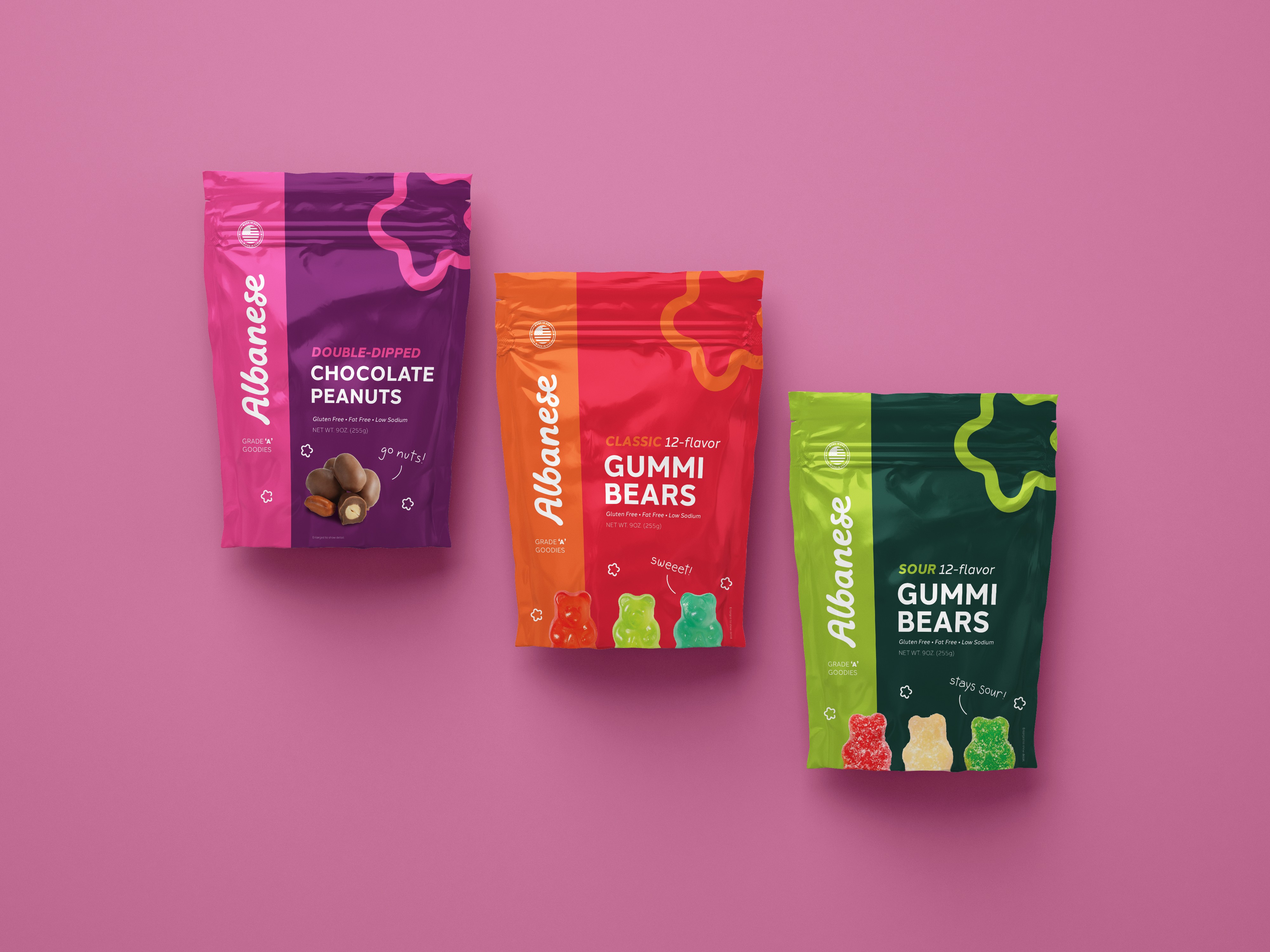
Confection lines:
-Chocolate
-Sweet gummies
-Sour gummies
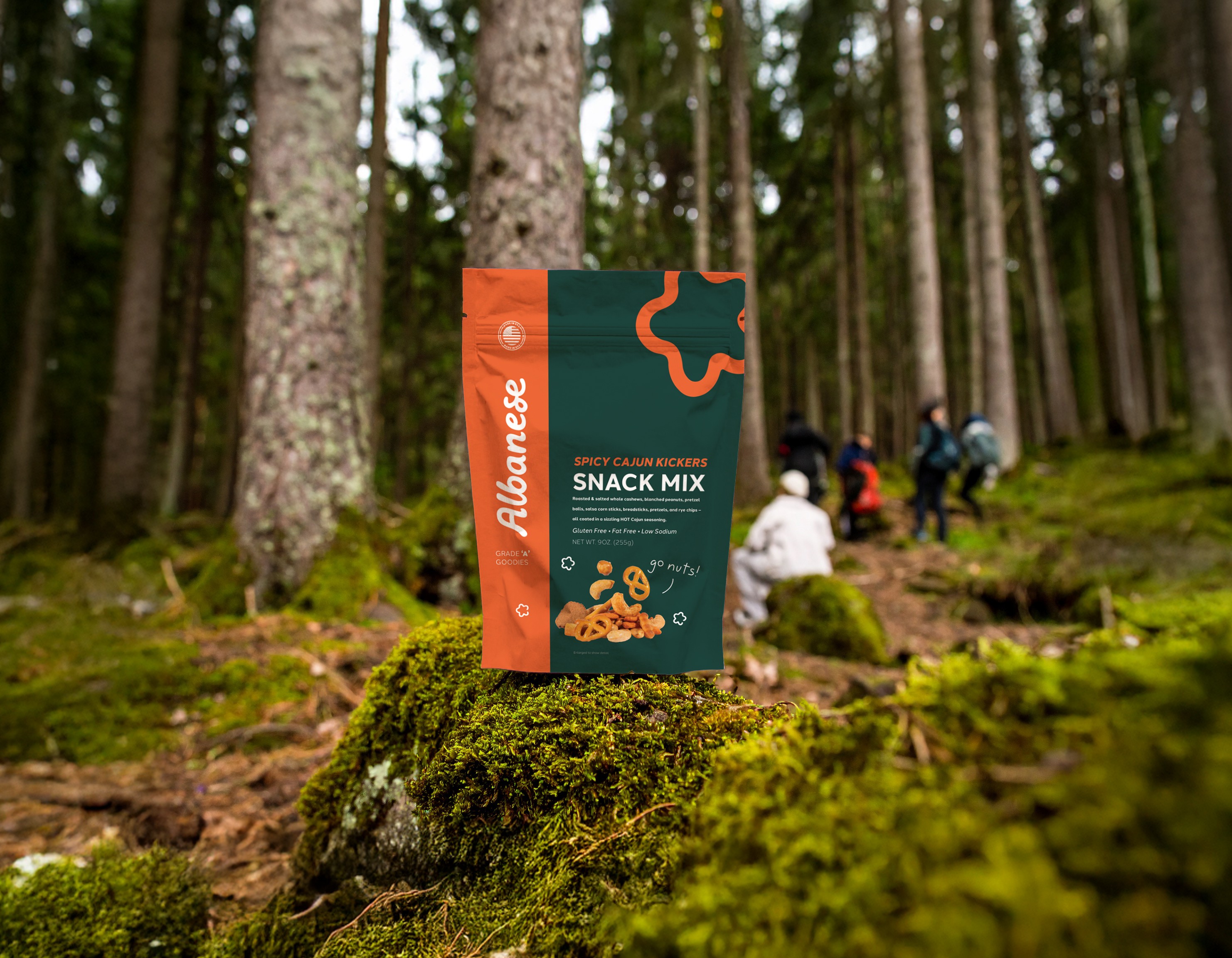
-Snack Mixes
-Nuts
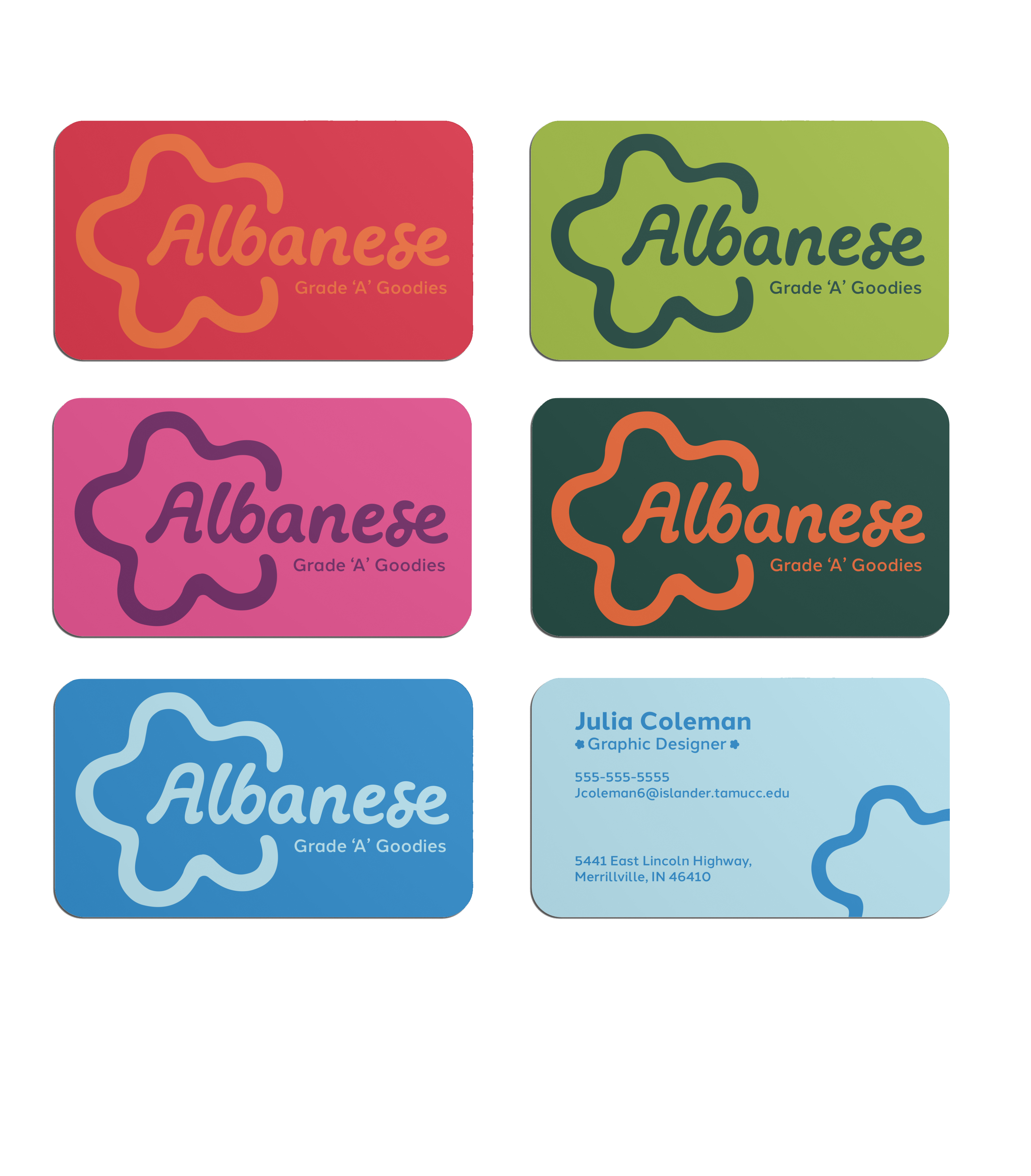
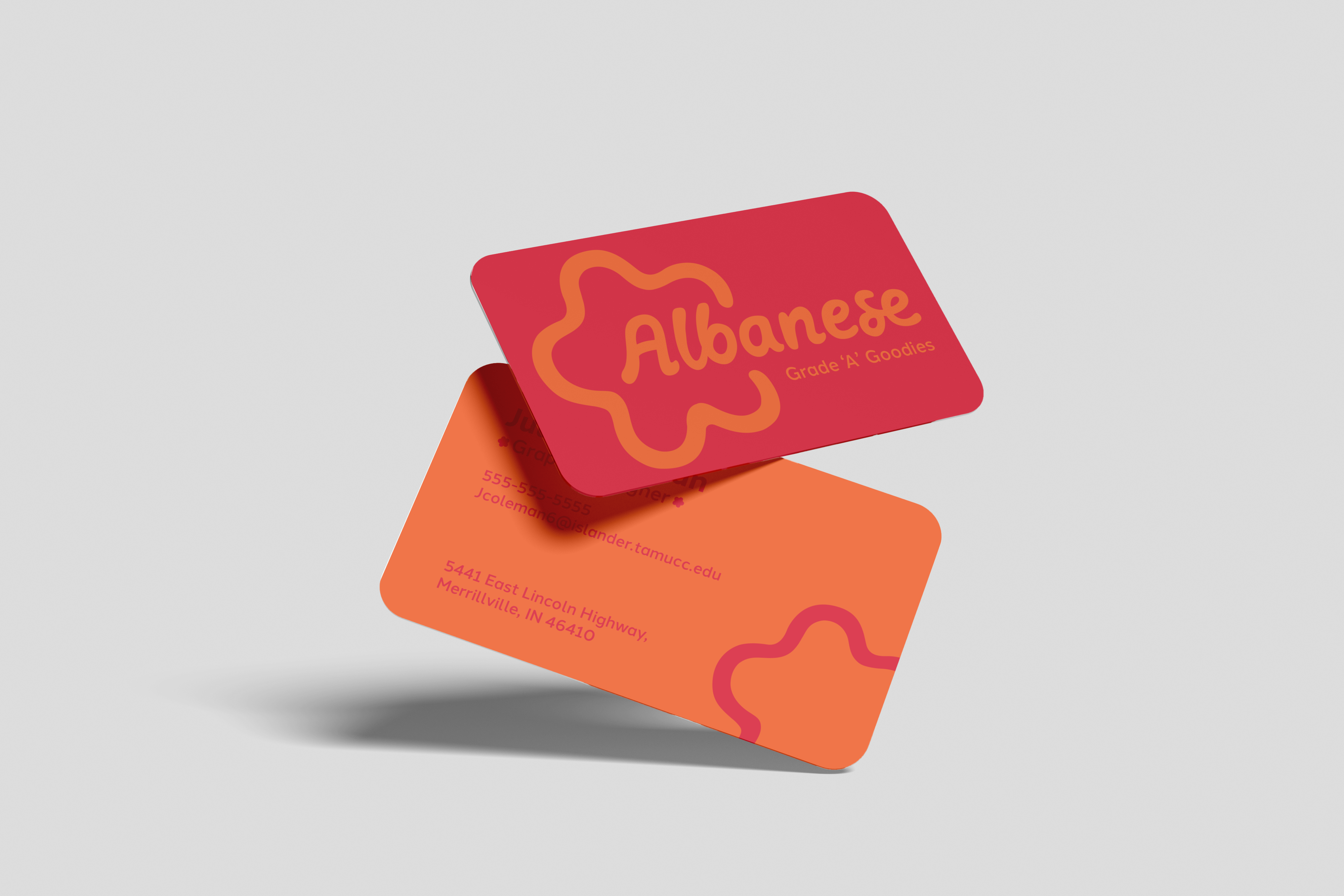
Company Media
Employees can choose their favorite-colored business card to have a more custom feel.
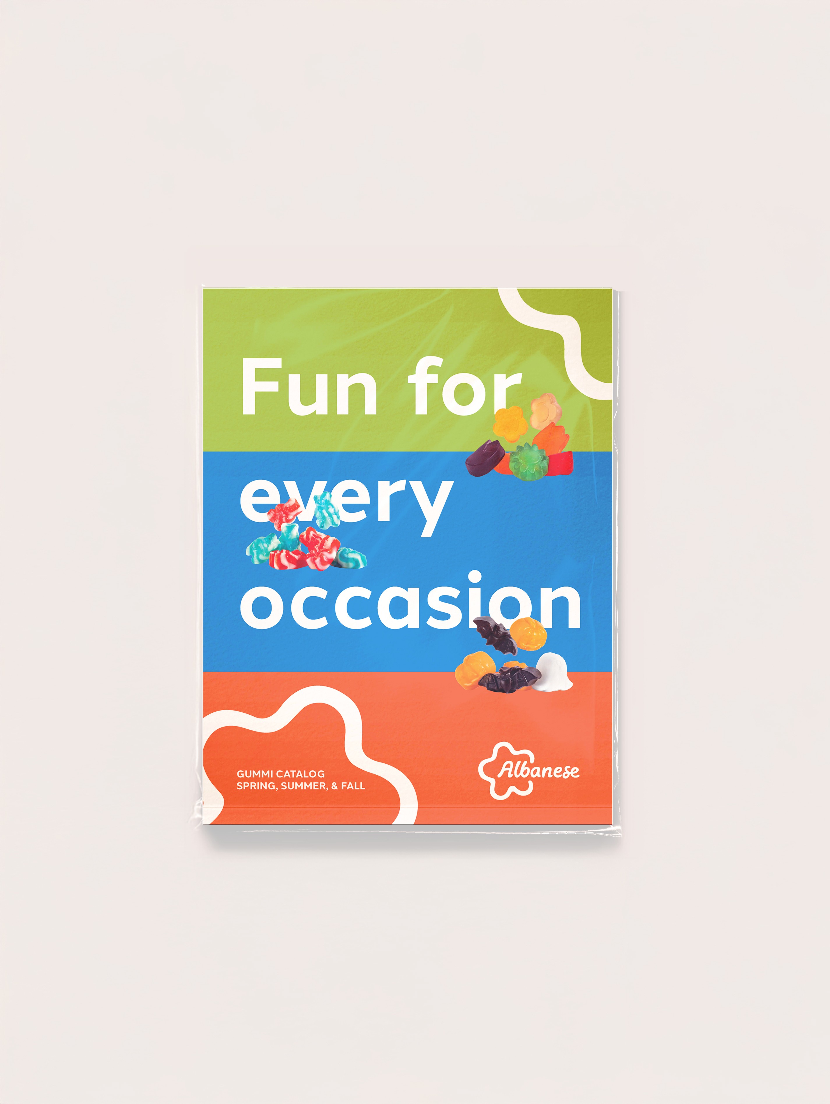
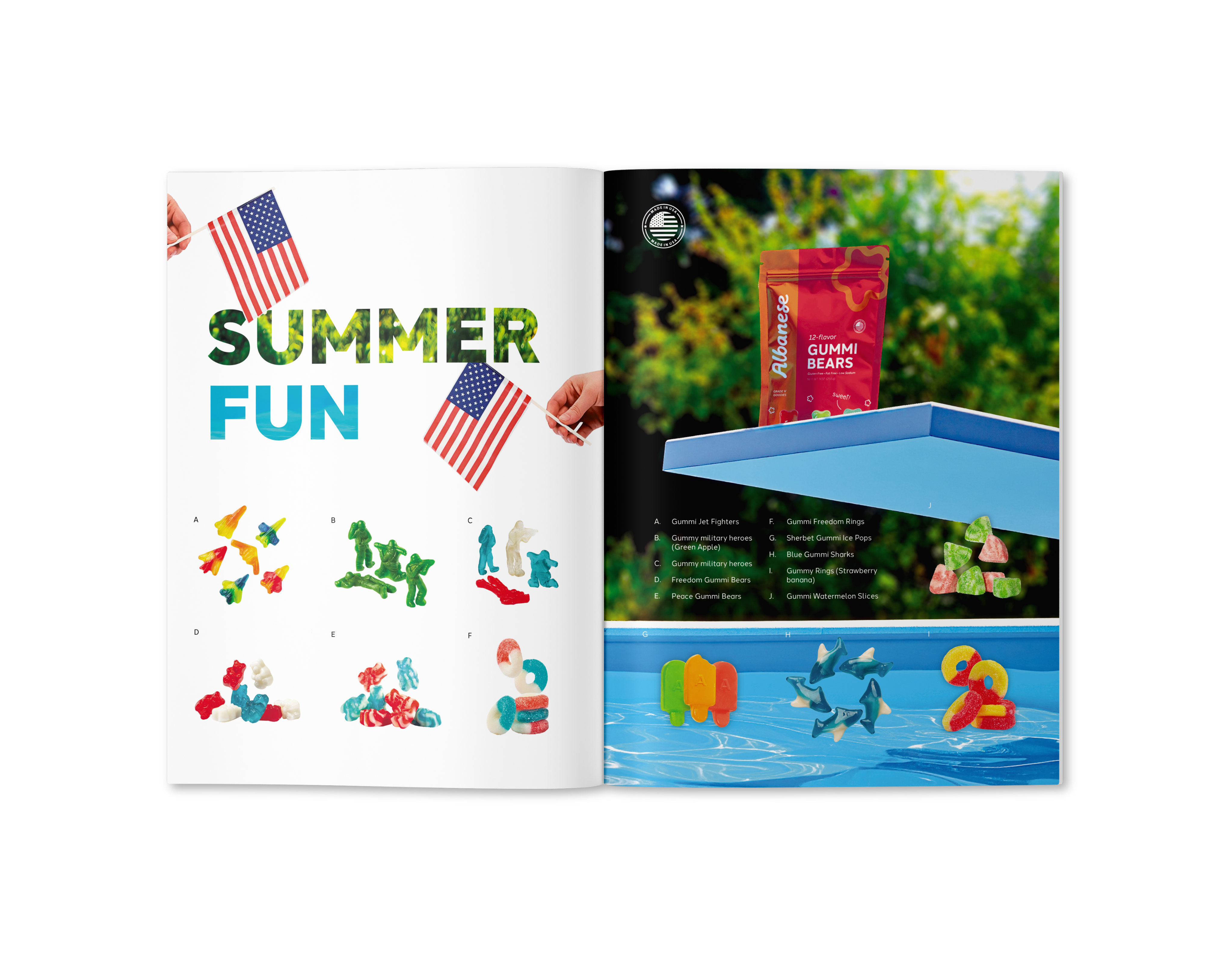
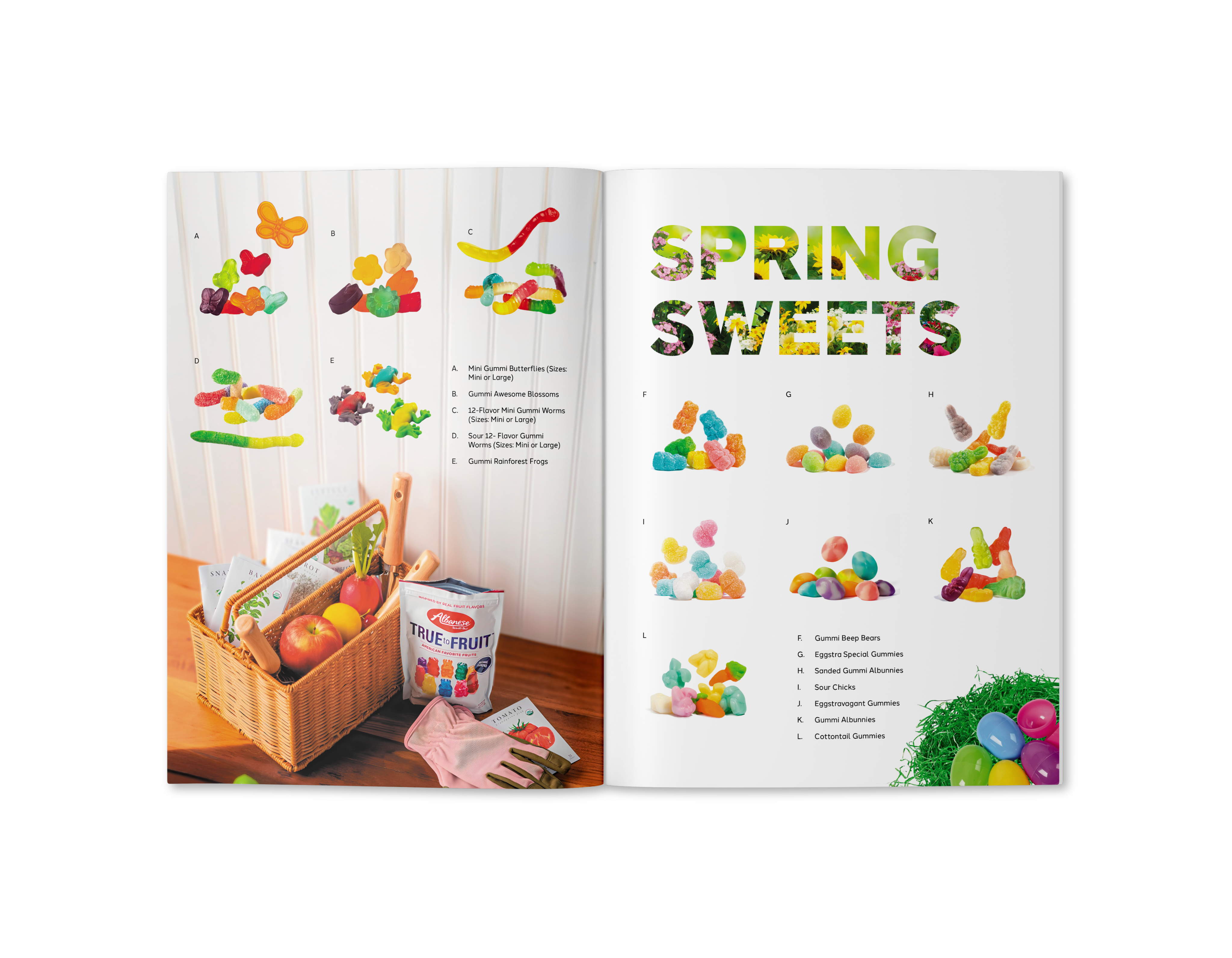
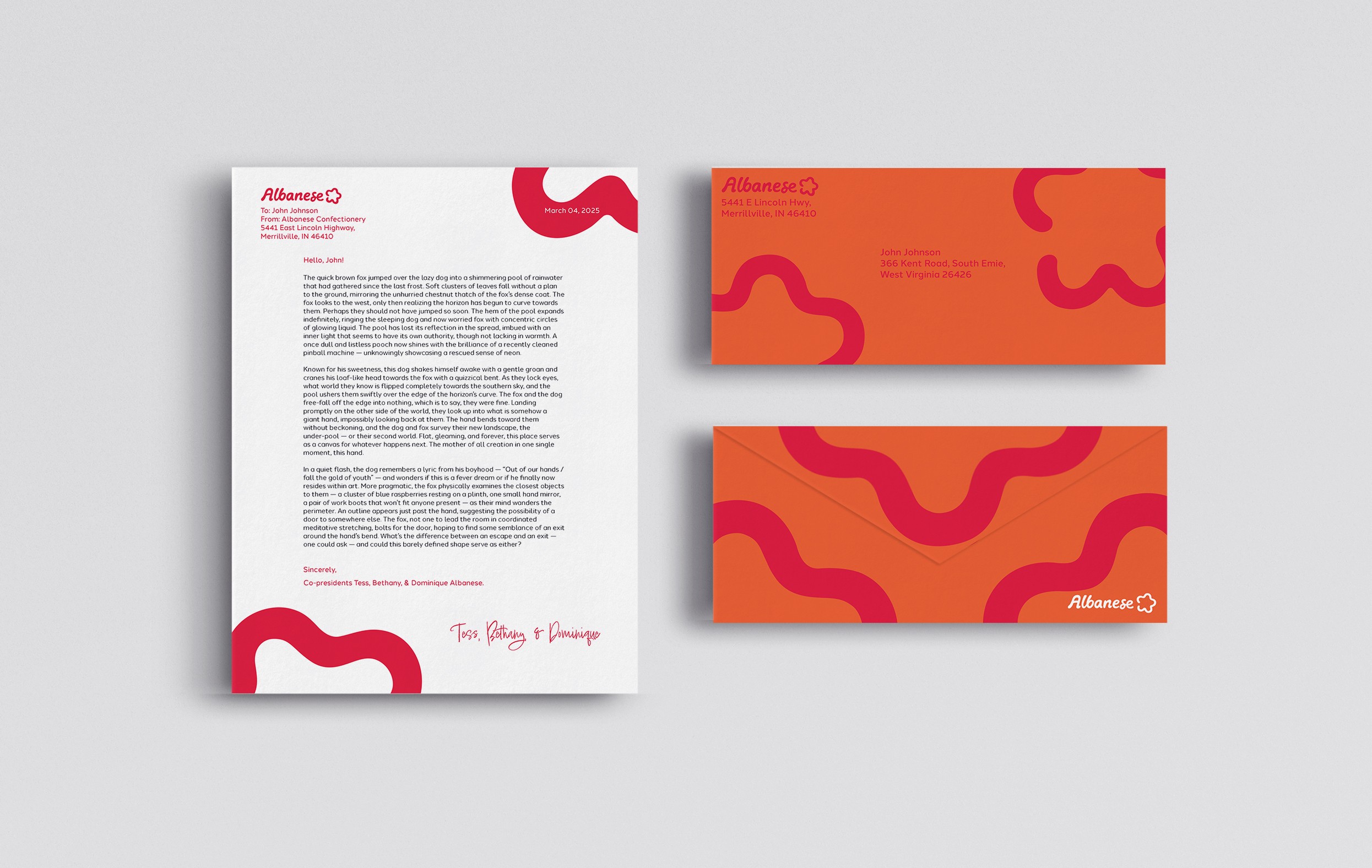
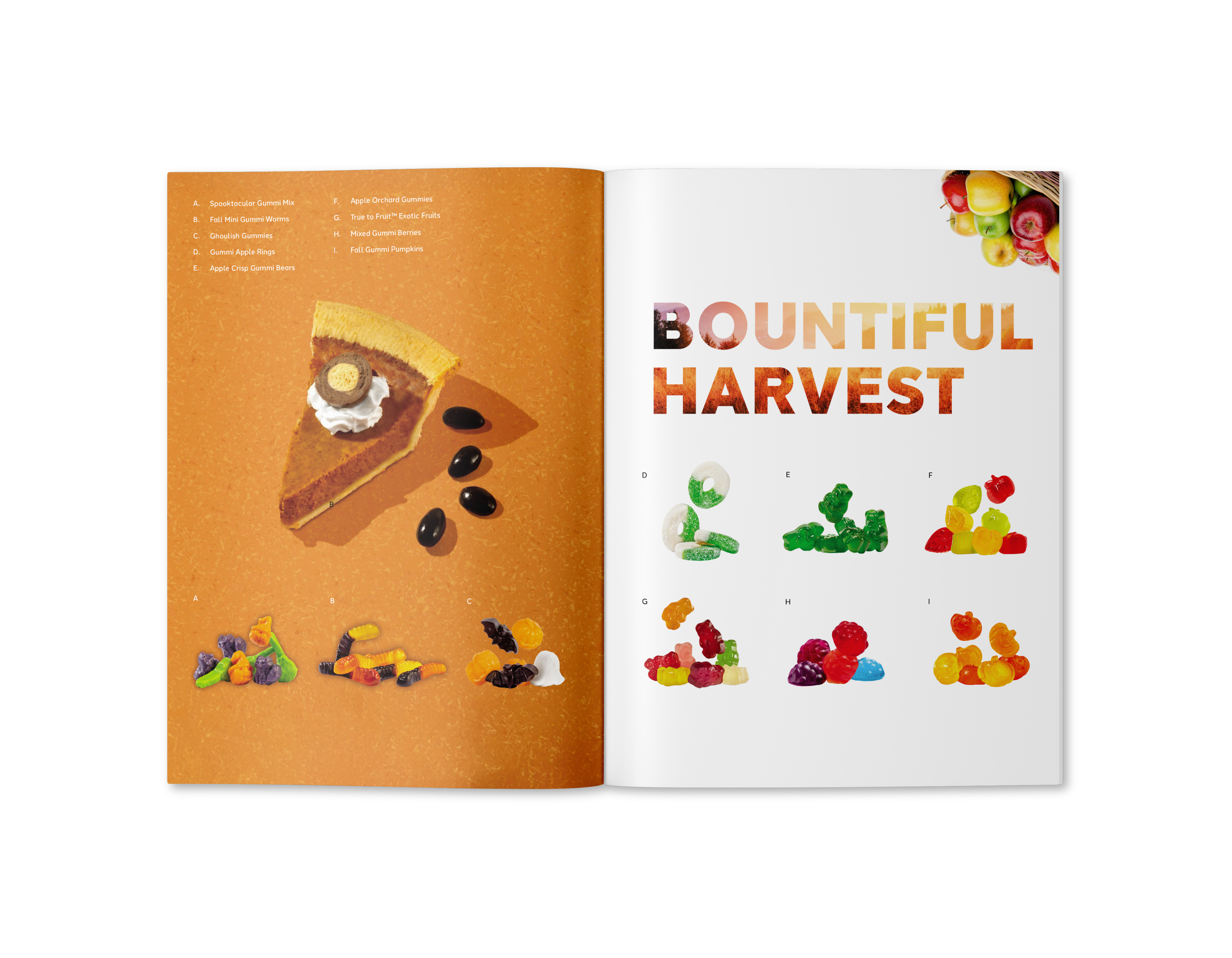
Catalog Mailer
A seasonal, free catalog that serves promote and feature holiday-related treats and snacks. These would be mailed to Albanese online customers who opt-in to a promotional bimonthly catalog.
Script-like, handwritten rounded fonts were considered for reference.
Solution
Shown here is the main Lockup with and without a tagline, as well as the logo alternates.


Family | Tradition | Achievement
Diversity | Fun
Key Values:
Mark & Logotype Sketches
Packaging | Company Media | Mailing Catalog
Deliverables:
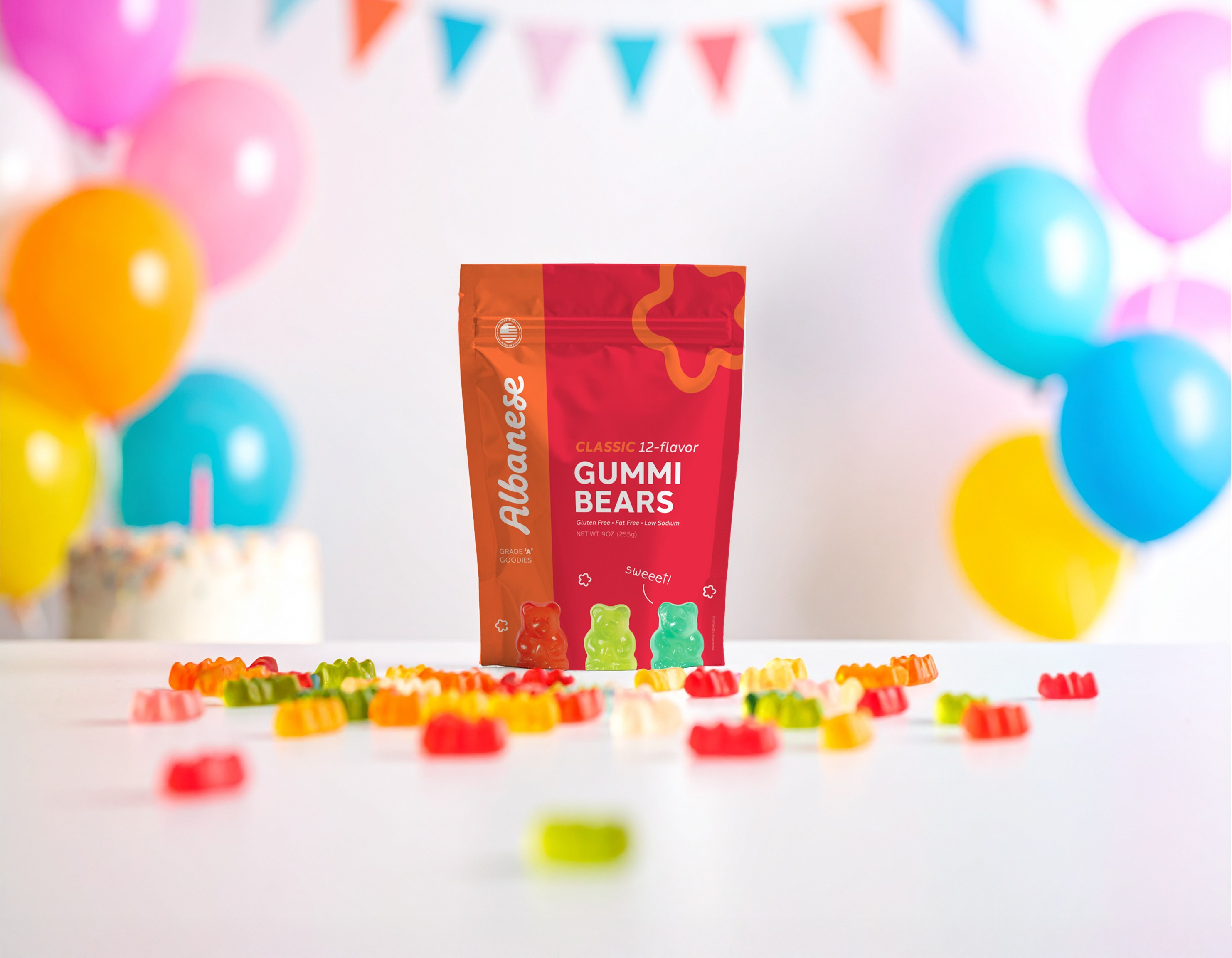
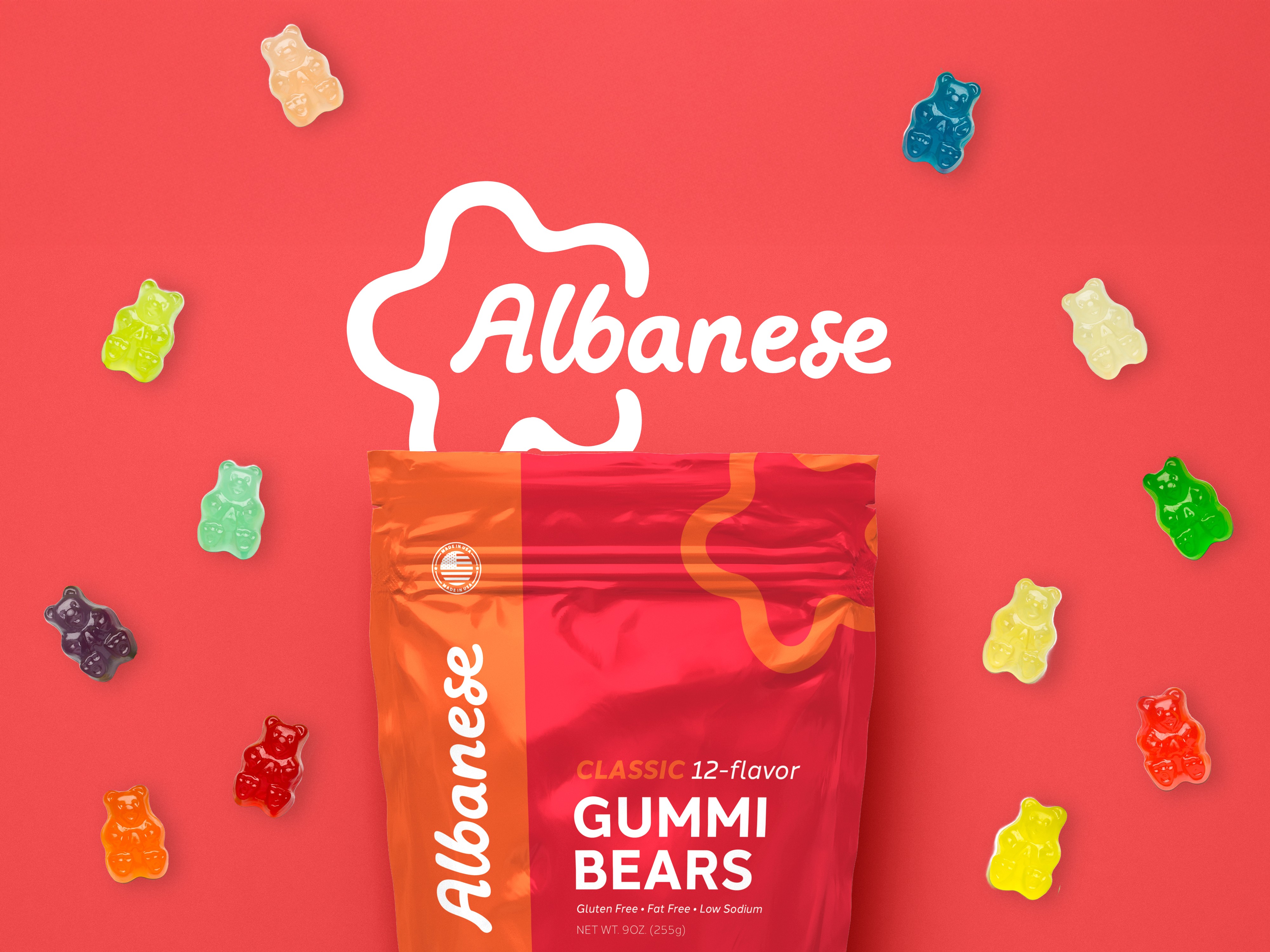
Packaging
Each color corresponds to each confection line that Albanese carries.
The Logo
The shape that I decided on for the mark was a star, a symbol which is representative of achievement.
This star also has 5 segments representative of the the company’s 5 diverse paths of specialty confections.
See the Full Research →
