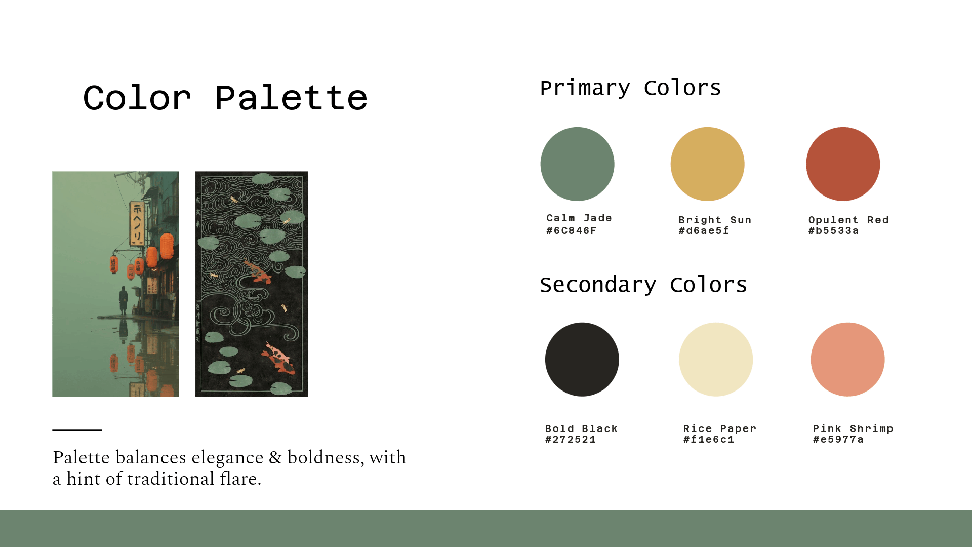
Overview
In this group project, we divided our work into sections. I was responsible for the logo, outdoor & indoor signage, packaging

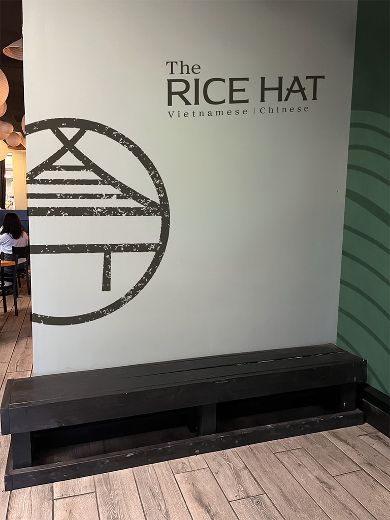
The Logo
The logo shape is a geometric circle often found in chinese architecture, with the shapes in the middle of the circle implying a person wearing a traditional Vietnamese outfit with adorned with a rice hat. The design can also be seen as an implication to asian architecture, with a curved roof and stilts.
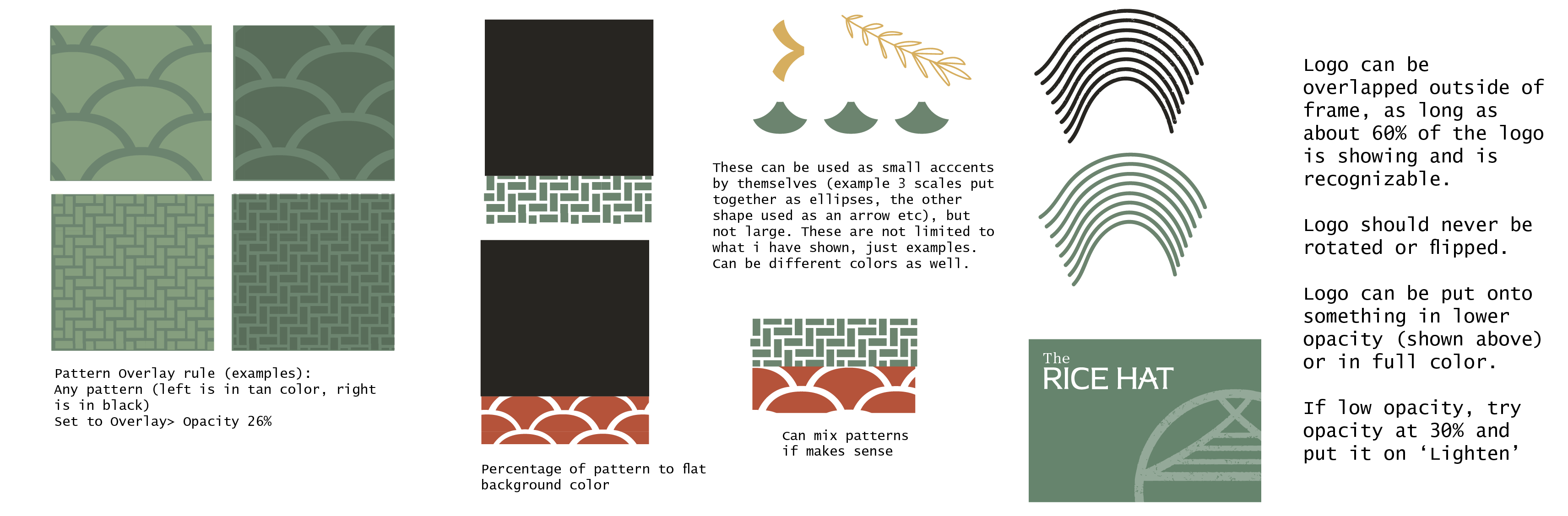
Brand Assets & Rules
Final Logo
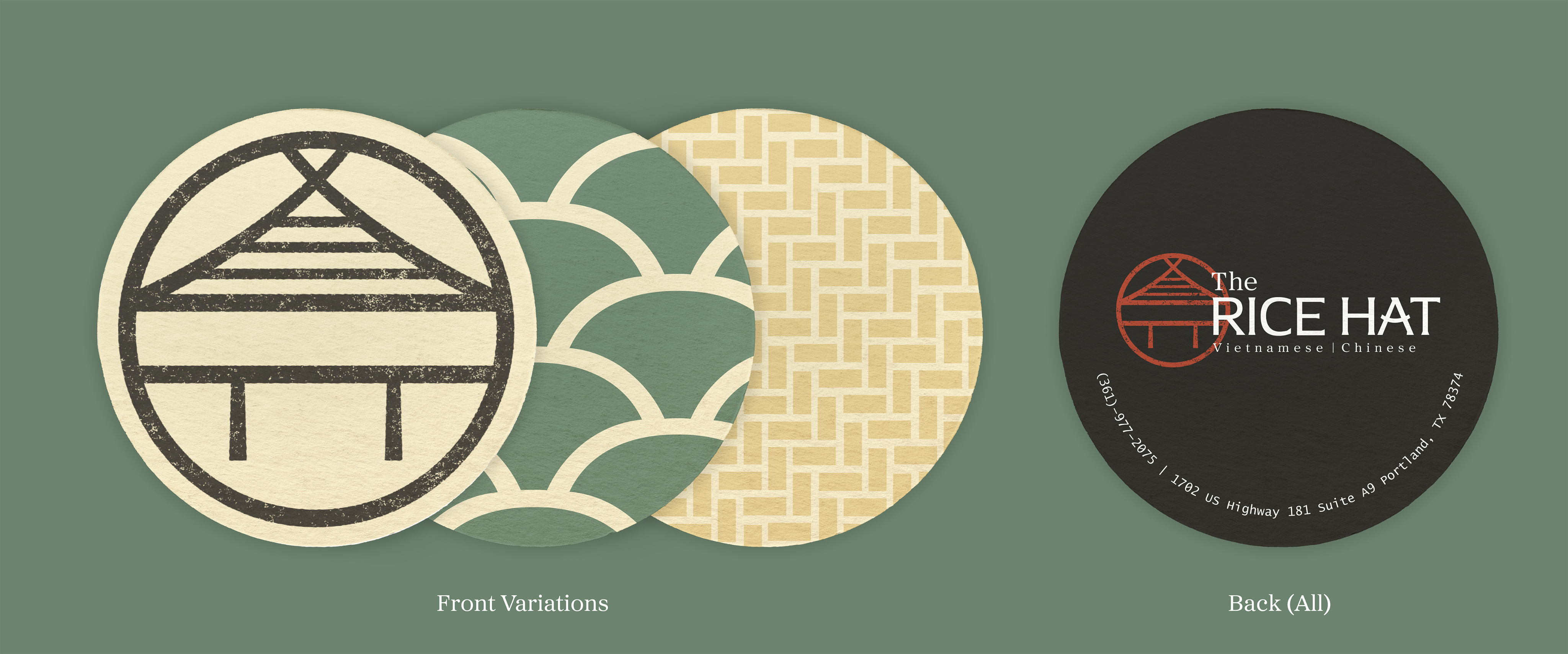
Stamp-like application. Vietnamese and Chinese description added for clarity.
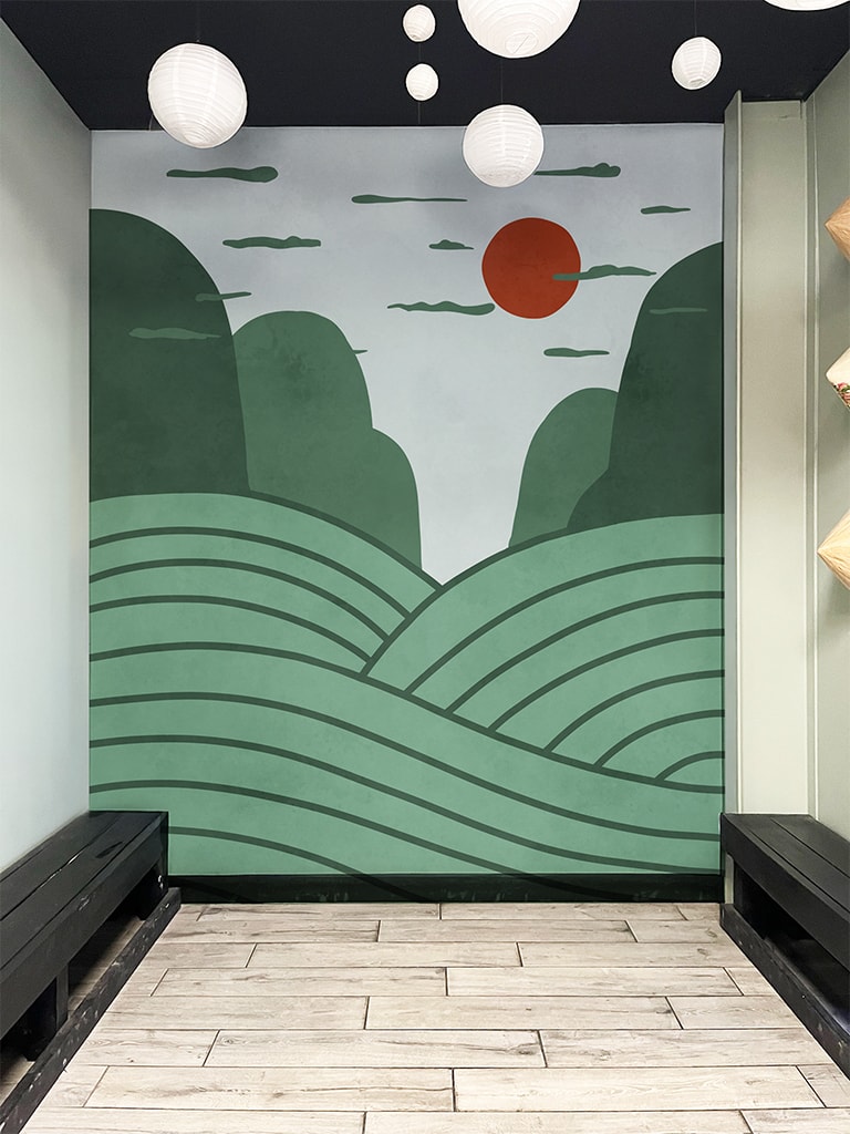
Wall Mural
To-go waiting area
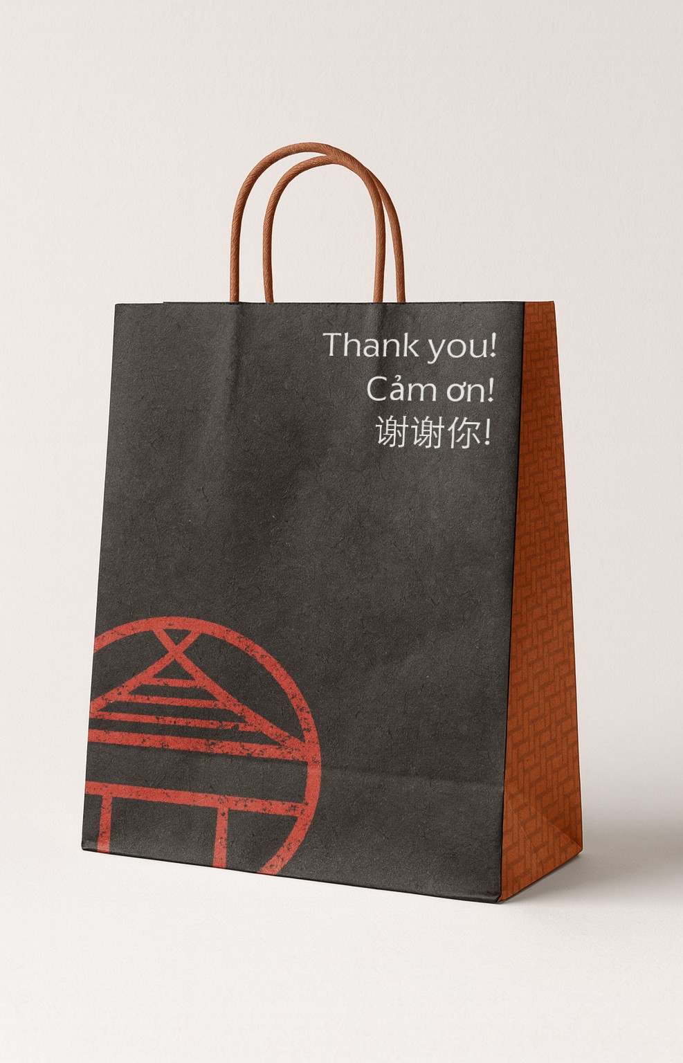
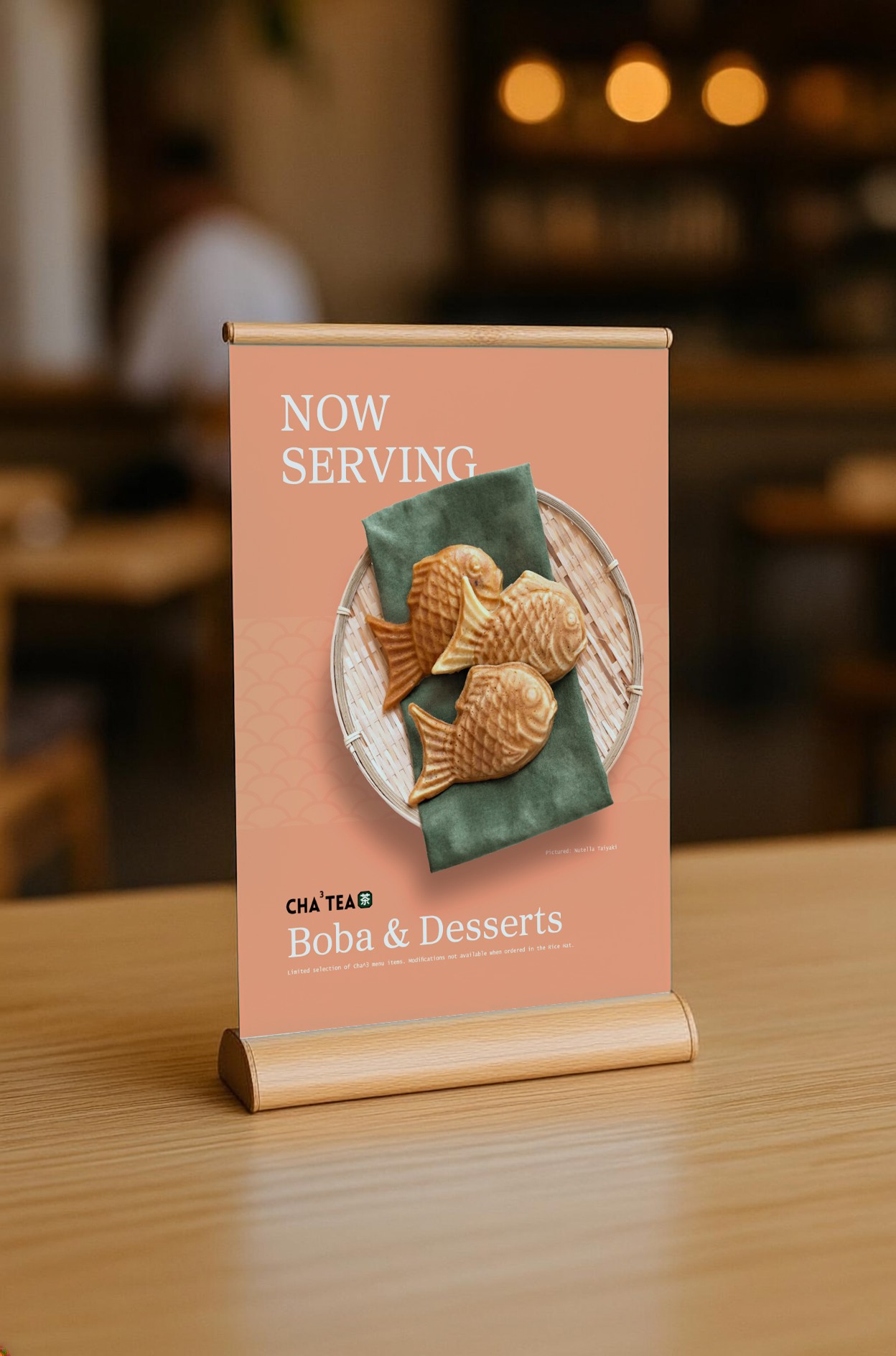
Packaging
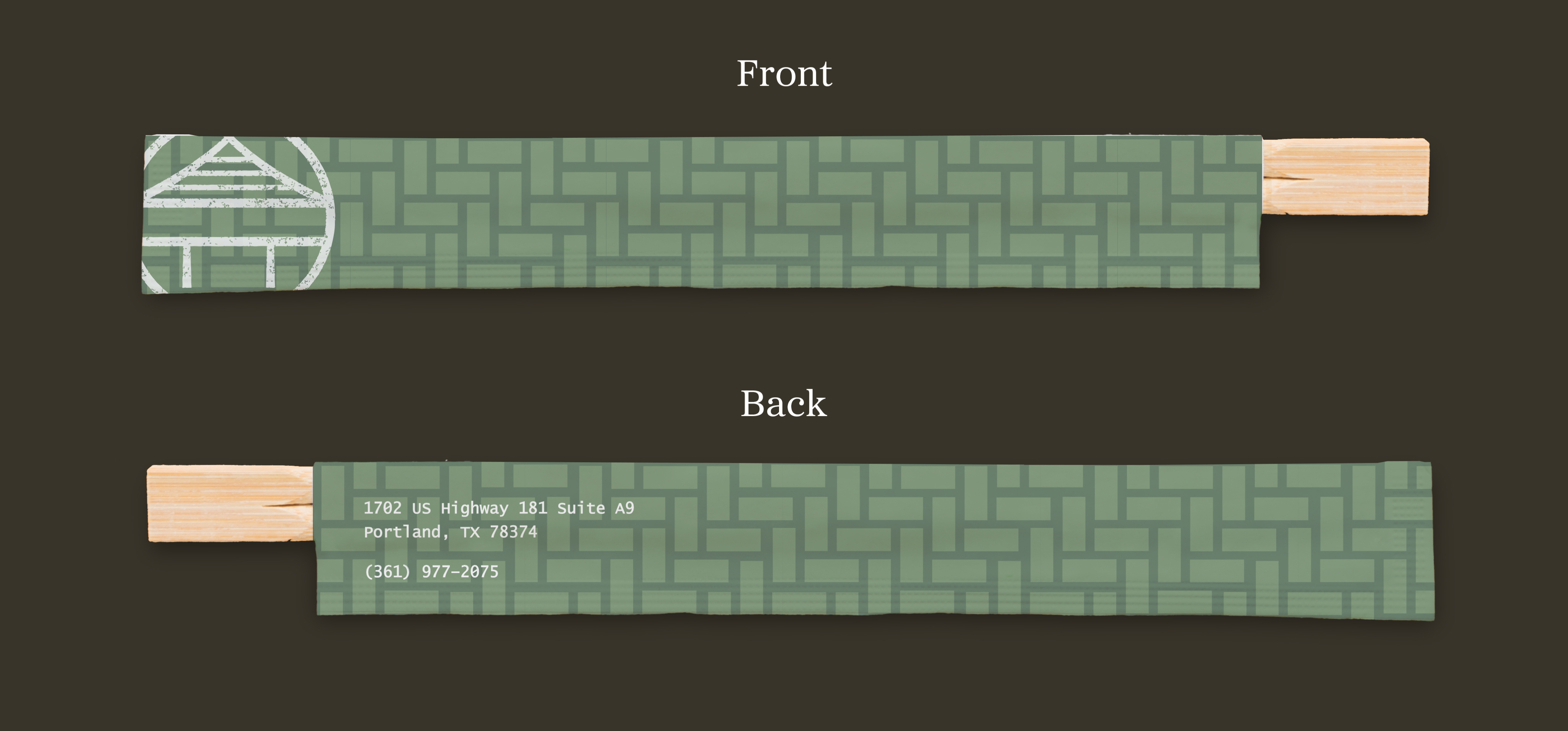
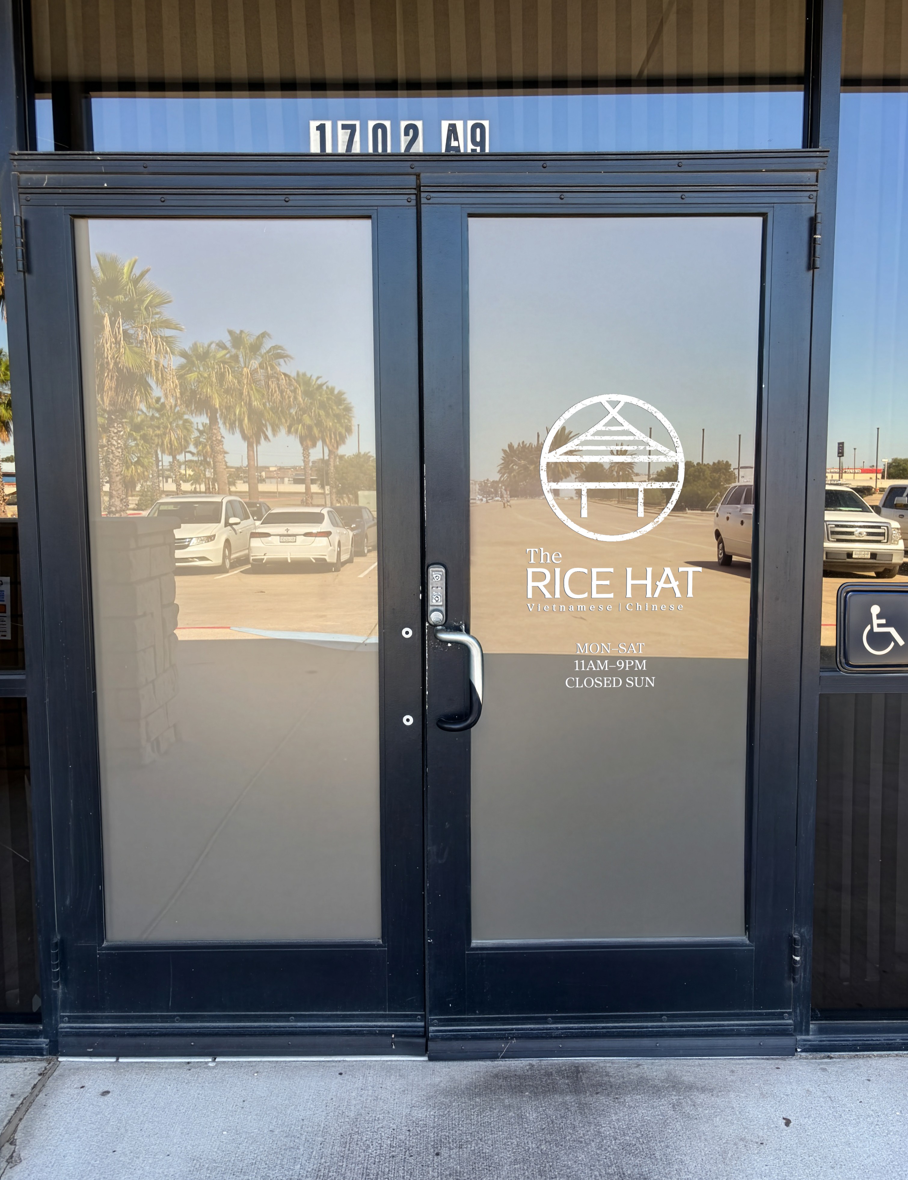
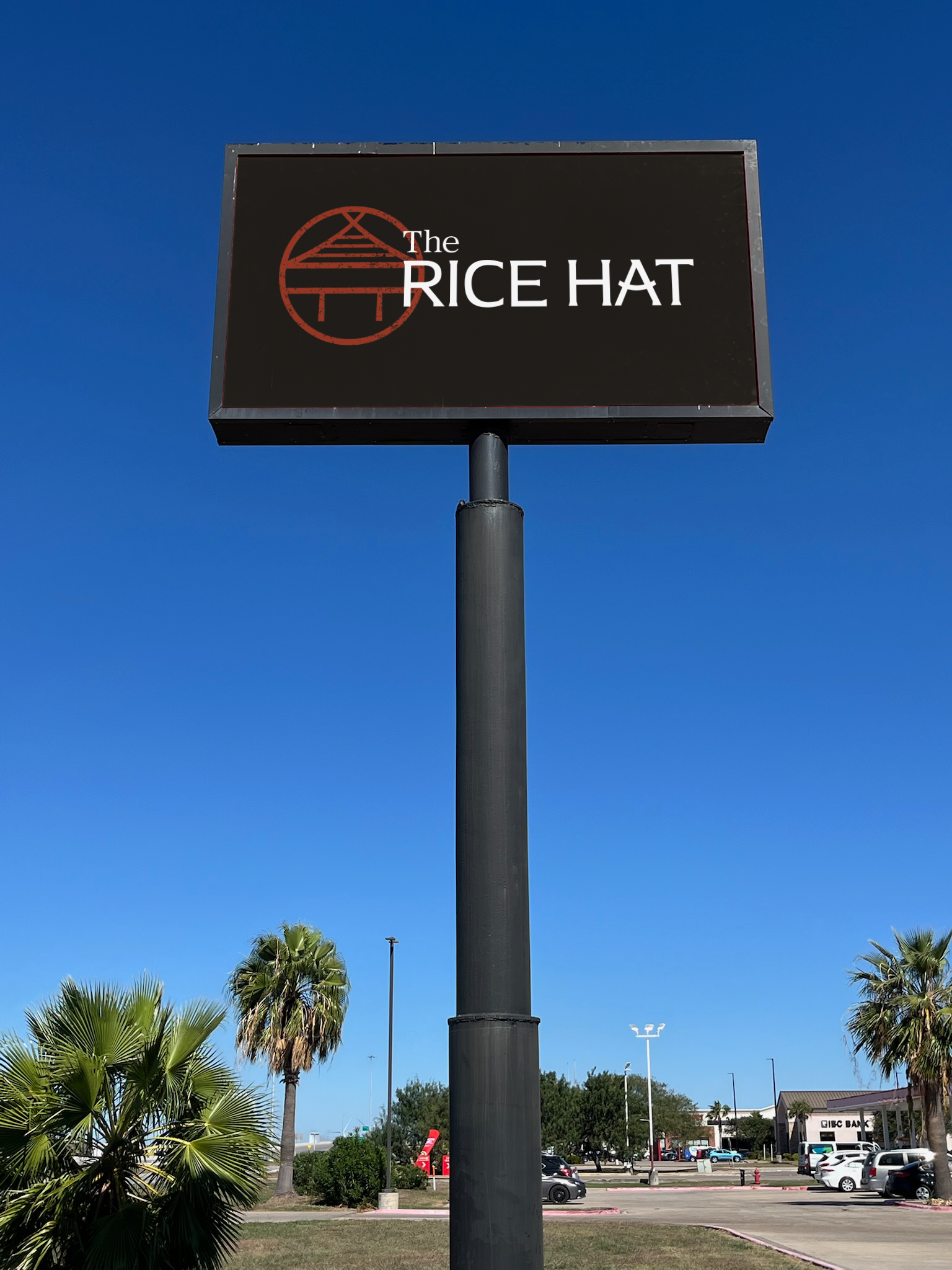
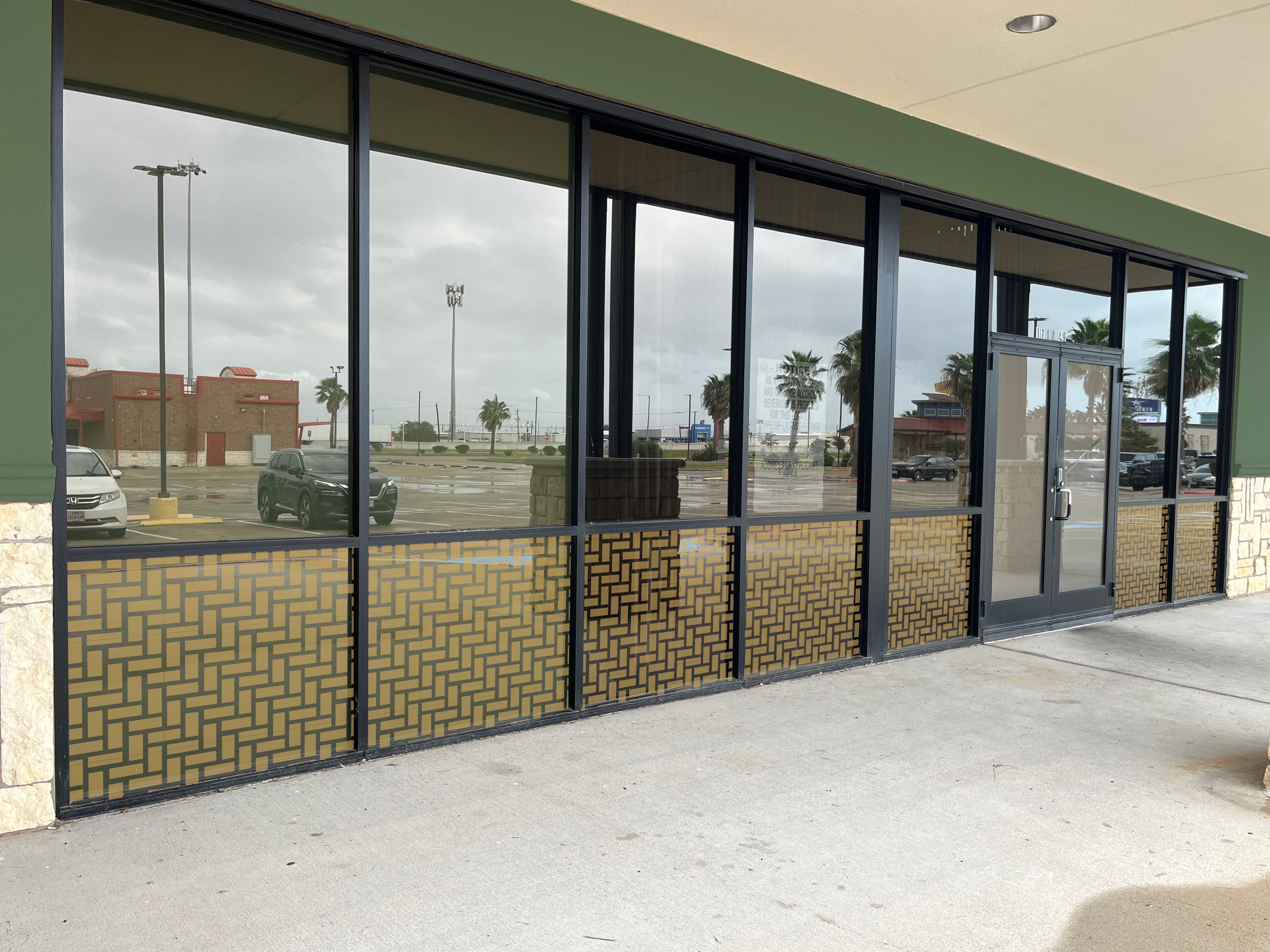
Outdoor Signage
A street sign was added, along with vinyls across the large windows on the entrance. The building sign and front door vinyl were also updated to match the new logo.
Strategy
My design partner and I liked the idea of the stamp behind the logo, which heavily inspired the final outcome.
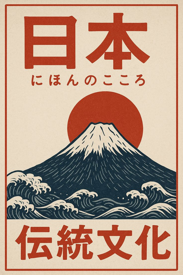
I wanted to include Vietnamese and Chinese stylings, so I did a lot of research on design style.
Chinese design leans towards refined, symmetrical elegance, while Vietnamese design is more focused on a relaxed, open, and airy feel.


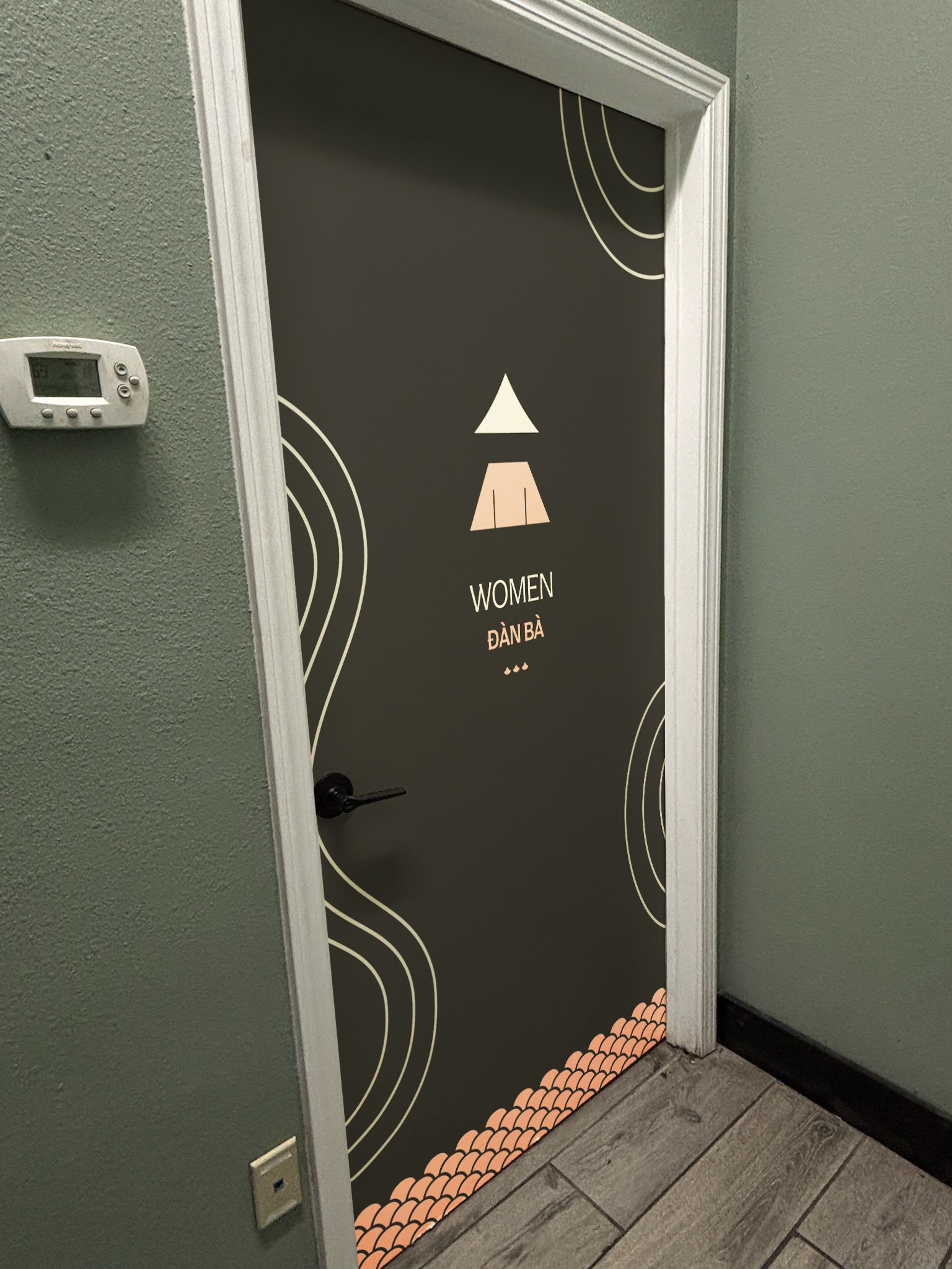
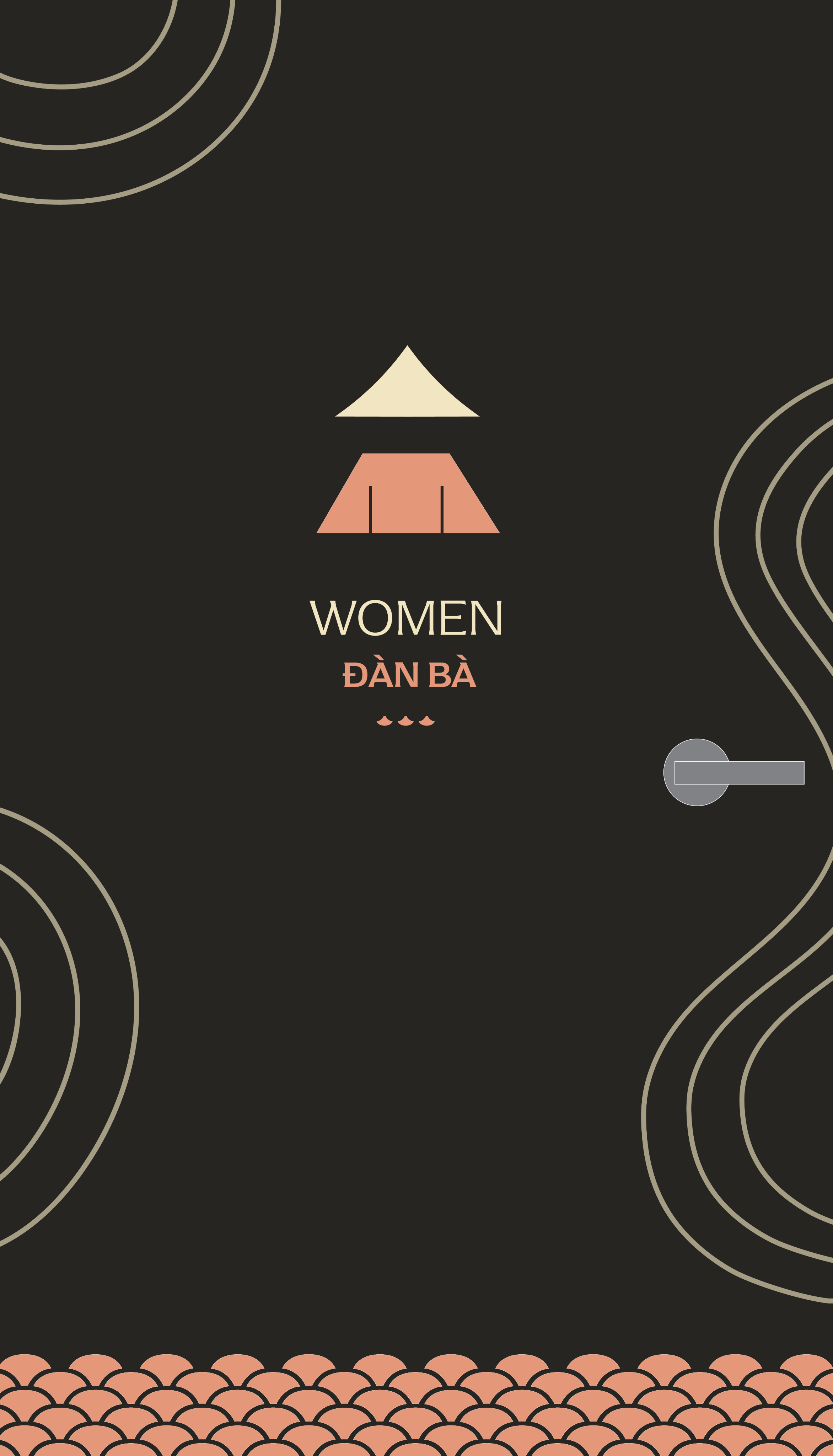
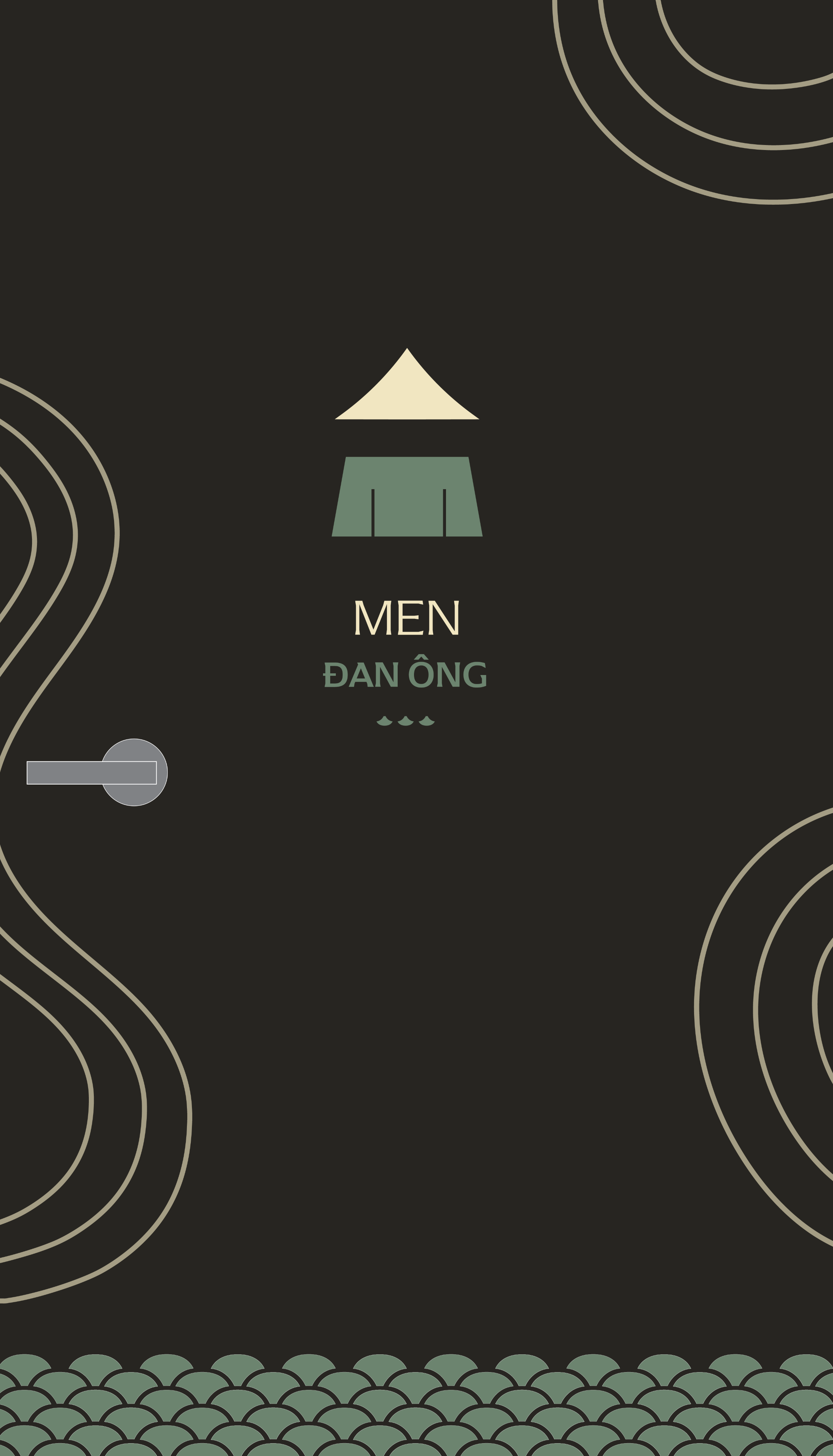
Door Art
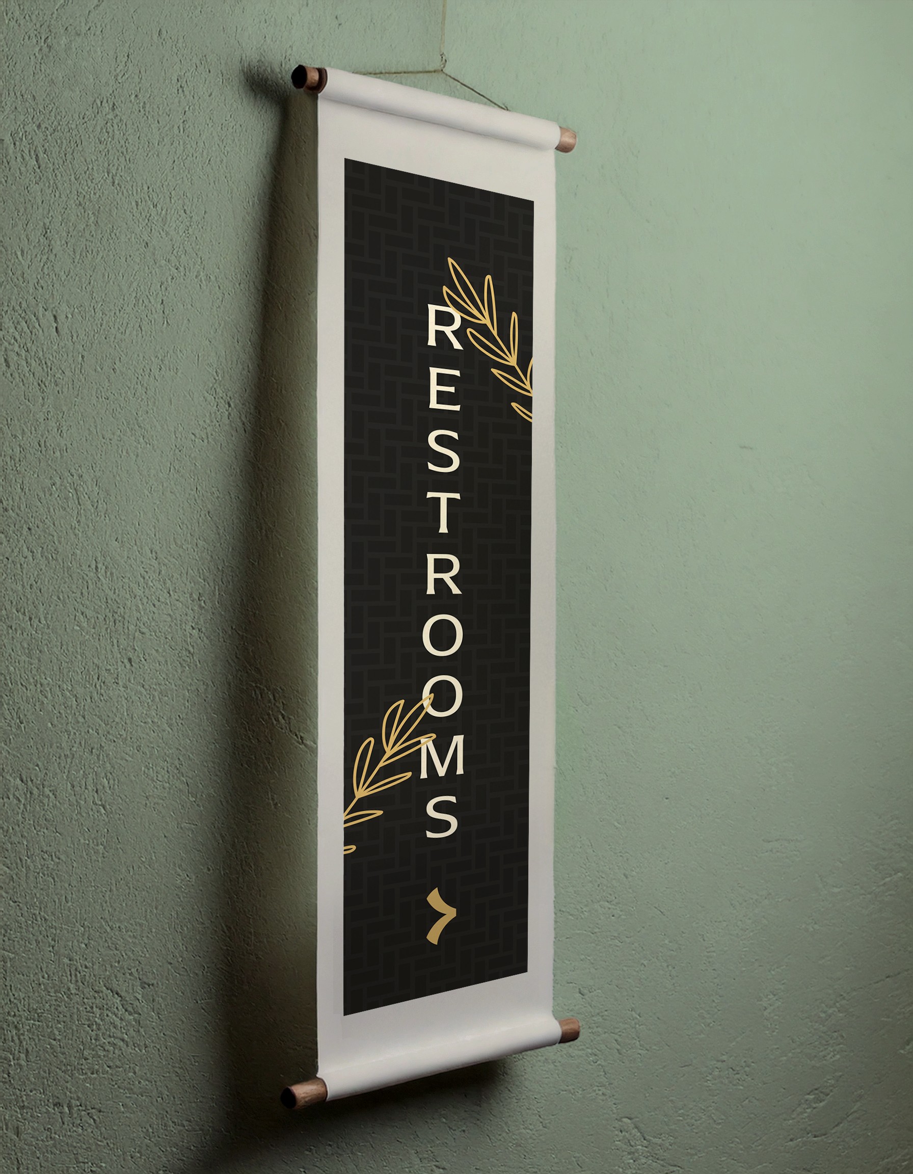
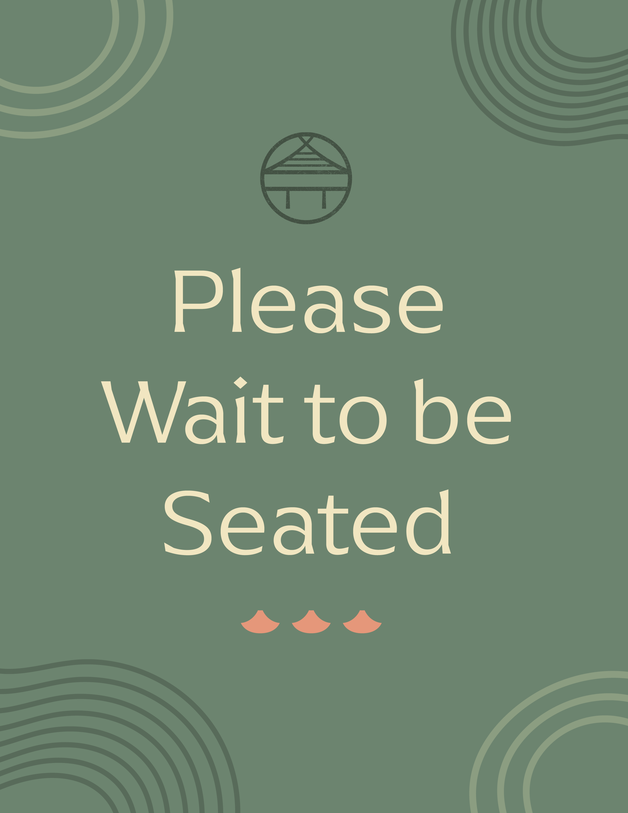
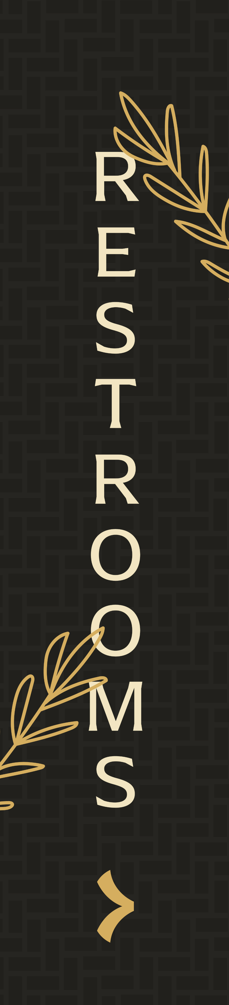
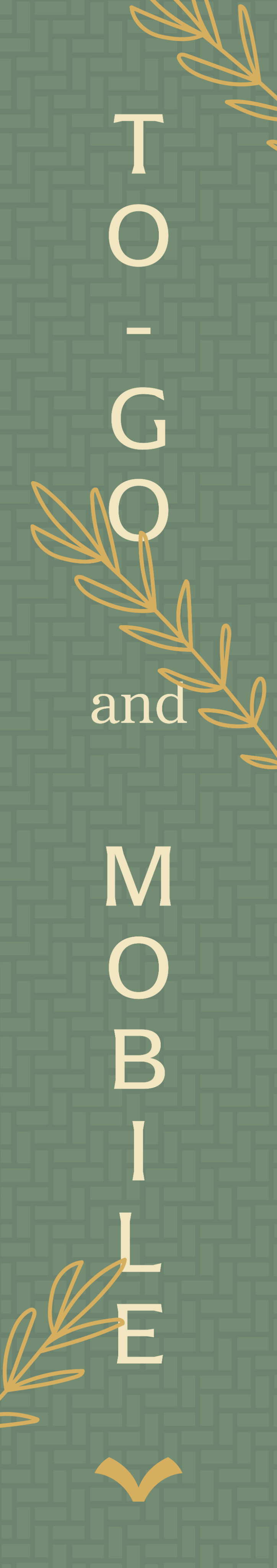
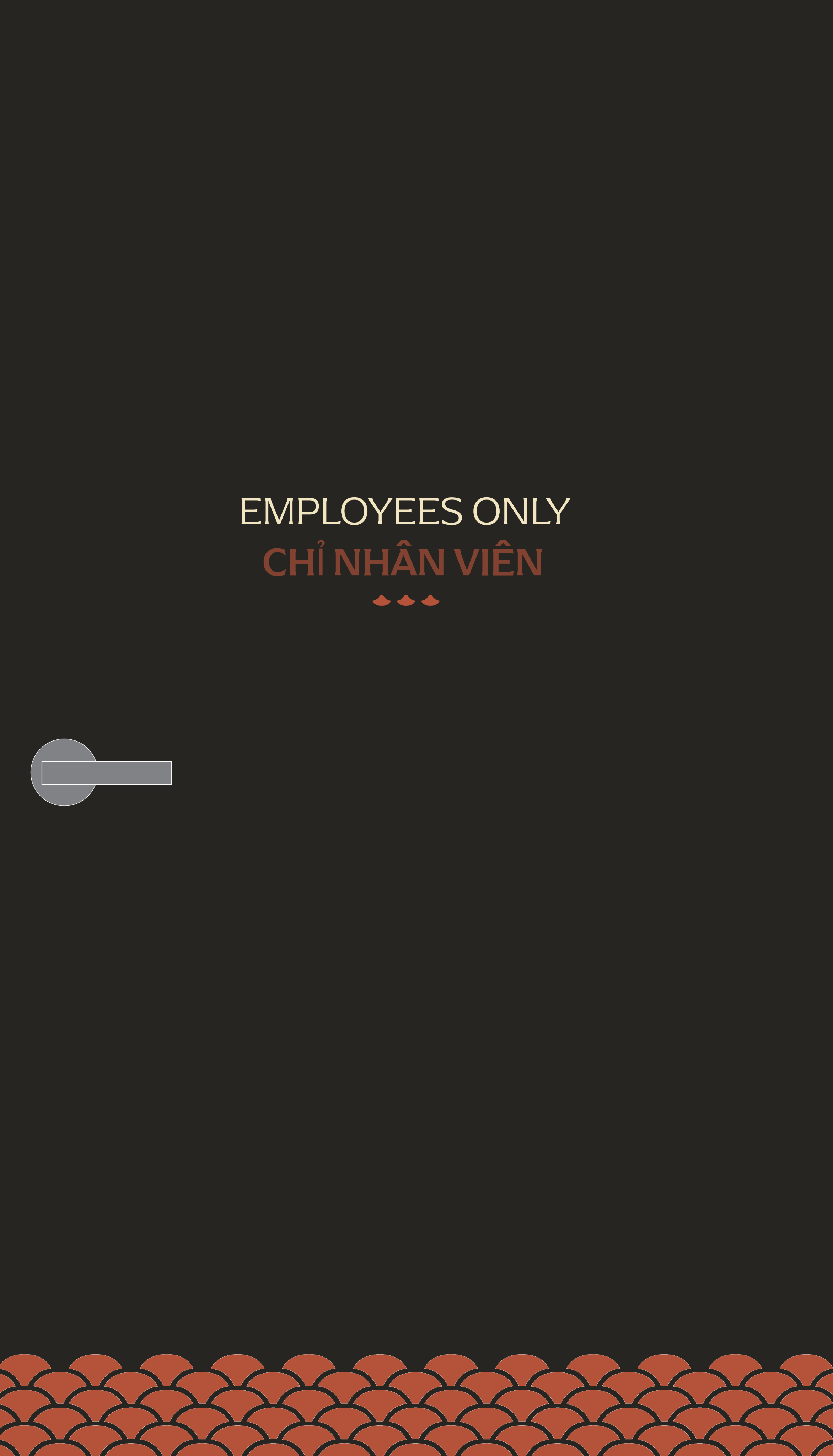
Indoor Signage